

Wednesday, 20 January 2010
Monday, 11 January 2010
Blog Analysis
Jonathan-Chapman
Feed-Noise
Siobhan Dunne
- It's nice to see a wide layout, as all of the blogs in our class are narrow. By using a wide layout, Jonathan is able to display bigger images. Additionally, the reader doesn't have to scroll down as much to read posts because the writing is spread out more.
- The navigation is very easy to use. It's spread out and labeled well with headings.
- The neutral background and fonts bring more attention to the images. They really stand out because of their colour and size.
- If I could change one thing, it would be for the blog to have a name instead of ".". It would make the blog easier to find for future reference.
Feed-Noise
- Not many blogs have videos, but Feed-Noise appeared to have one which I was initially interested to watch. But when I clicked play, It didn't work. It would be good if maybe the author regularly browsed posts to notice and correct errors like these!
- The white font on black background makes text really easy to read, and the images stand out.
- On some of the posts with alot of photos, it could be good to put the text before the images so that the reader understands what they are looking at.
- Links to references are a nice addition as the reader can carry on their research.
Siobhan Dunne
- Nice image on the left hand side of the page makes the blog different from others.
- The about me is awesome because the reader is given an insight into what the blog is used for, the subject of the photos and a small background of the author. The hyperlink to a more detailed profile is a nice touch.
- There are no labels, which could become a problem the more posts the blog has. Readers could find it hard to navigate around the site.
- Some posts are unfortunately empty which makes the blog look slightly messy.
Monday, 4 January 2010
Home


Improvements
I decided to make some improvements to my blog - to make it visually, the best I can and to keep it new and interesting.
The first change I made was to add a search box using the gadgets tool in "customise blog".
This was because the more posts I make over the next two years, the harder it may be to find some of my images.
For example, the reader may want to find a scan of headphones without trailing through several pages of my blog and so the search box can be used by entering the key words "scan" and "headphones" to find it easier.
From looking at other people's blogs, I saw that by putting their labels at the top of the right hand, it them a lot easier to find. I decided to do the same as previously you had to scroll to find them.
Next I moved my "blog archive" gadget higher up the page above "followers". This is because the archive is more important and should therefore have more priority.
The orange font of "followers" was also changed to pink to match the rest of my blog.
Finally I added a text box underneath my self portrait on the right.
This was because I noticed that readers other than my college peers were following me. It's just a short paragraph to explain what my blog is used for, and who I am.
I've decided to keep the colour schemes and layout of my blog the same because I feel that it is already easy to read and navigate.
The white background is good as it doesn't distract you away or clash colours with the images that I post.
Saturday, 2 January 2010
Jimmy Sullivan

"The world lost an amazing drummer two days ago.
To say I was devistated is an understatement. I've been a fan of the band for as long as I can remember, and when I was walking around my secondry school pretty much on my own cause I was "different" or "uncool" - it was their hoodie that protected me from their words.
Upon hearing the news I dug out his drumsticks and it felt like I was holding onto part of a legacy, and I'm sure I can speak on behalf of all UK fans when I say our thoughts are with him, the band and his family at this time. "
This was my tribute to one of my favourite drummers of all time - Jimmy "The Rev" Sullivan of Avenged Sevenfold who passed away aged 28 on the 28th December 2009 from natural causes.
I didn't really know how to express my feelings and emotions about it, people were starting groups on facebook etc but to me, it didn't help me deal with the loss by joining a group.
So I took out his drumsticks that were given to me a few years ago, placed them on my bed, and using a 50mm f1.8 (I used this to get as much light as I could into the image), I focused on the end of the sticks and took the above photo.
I edited it in Adobe Lightroom, and chose a high black and white contrast preset, altering the settings to my own personal preference.
I chose black and white because to me, it enforced the idea of "the past", a "memory", and it was also in respect to something really sad.
The white sheet was used to place them on because to me, white is a symbol for innocence and purity.
I like the way it came out, it's nothing fancy but the sticks were his and used by him at one of the last UK shows he performed in. Drumming was his passion and life and so even though theres technically not much to the photo, the meaning and PAST behind the sticks means a hell of alot more.
Jessica
 This picture was taken to demonstrate high key lighting for my "In A New Light Project".
Natural lighting was used, and by taking the image in a well lit, white painted staircase, I managed to bounce the light off the walls surrounding us creating a shadowless image.
I then ran the photo through photoshop, making it slightly lighter using curves and levels, dodging the white background and shirt to blend them slightly and burning parts of her hair to bring out the colours even more.
I also saturated parts of her lip to bring the pink out.
 This next picture was taken a while ago, but I'm using it to show low key lighting. It has a moody feel to it because of the colours and lighting. It was taken in a staircase in Hyde Park at night, so that was how I achieved the darkness, and the light coming from above left was from a street light lighting the staircase for the public. I made her stand halfway up the staircase so that the light was shining directly into her, and made her look towards it to light her face.
Enhanced in photoshop, I can't remember what exactly I did but I would have messed around with the contrast, saturation and colour balance.
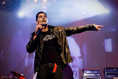
Music
In my spare time I take photos at live shows. Here are some that I've taken in the past few months each enhanced in Photoshop.


Blog Analysis
I was asked by my tutor to have a browse at the blogs of other students in my class. I picked out a few that I liked:
ScrewedUpPhotos
Lillian's Photography
ScrewedUpPhotos
- Nice white background which makes her images stand out and posts easy to read
- Clear labels which makes it easy to navigate around the blog
- Lots of posts to have a read through - each is annotated well
- My favorite post is the one with candles. I love black and white images. It's artistic and it resembles black and white film photography which I also love.
- I like that the labels are on the left hand side rather than on the right which is more common. You can see them straight away along with the title which is really good if you're eager to find something specific.
- All of the images are annotated well and she has clearly explained what steps she made in photoshop to get her final image
- It could be good sometimes if the original photo was posted to see what it looked like before
- More photos because the ones posted already are great!
Lillian's Photography
- The Paramore photo is really good! Lily has manipulated it really well
- The choice of light blue writing is good as it's easy to read on the black background
- I like the banner in the title as it goes with the rest of the blog
- It would be good to see some more posts too as the rest are really smart ideas
Black And White Manipulation
I edited this photo in Photoshop too. I first desaturated the image and then added more contrast by changing the levels.
I then saved it the same was as I did previously.


I then saved it the same was as I did previously.


Colour Enhancing

I took this photo while out for a walk down a local river, but I didn't like how dark it came out. I decided to correct this, and the colours in Photoshop CS4 by doing the following:
- Opened in Photoshop CS4
- Auto toned it
- Made it slightly lighter by uping the levels and curves
- Increased saturation to +26
- Went to color balance and increased the green to +8 to bring out the grass even more
- Dodged some of the whites and grass on midtones 37% exposure
- Burned some of the darks on 13% midtones exposure
- Increased contrast by 8
- Saved a larger edited JPEG version
- Renamed to "cow"
- Saved another "cow_smaller" version at 72DPI for my blog
This is how it came out:

Subscribe to:
Comments (Atom)
